

Define Your Art Style
Explore our Art Styles Index to find wall art by colour, mood, and design style. Browse a growing collection that includes city prints, maps, travel posters, nursery art, blossoms, and more, all organised to help you find the right look for your space.
Your City, Your Style: Did you know that every one of our 260+ cities can be designed in any style you see in our index?. Our entire database has grown over the last decade through direct client requests. If you’ve found a style you love but can’t see your favorite city in that specific look, simply contact us—we can customize any already designed city to match your preferred style upon request.

NEW SET OF 3 PRINTS
Three piece wall art designed to work beautifully with any city.

NEW CITY MAPS
Flexible city map layouts available for any city in the collection.

BLOSSOMS WALL ART
Soft floral wall art created to bring colour and calm to your space.

NURSERY WALL ART
Gentle nursery prints designed for sweet, playful, and modern rooms.

OBJECTS WALL ART
Bold everyday objects reimagined with playful shapes and a clean retro edge.

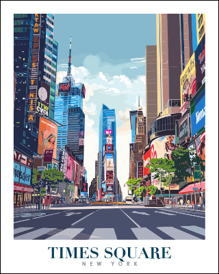
YOUR TRAVEL POSTERS
Colourful destination prints with vintage character and a fresh illustrated feel.
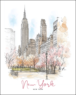
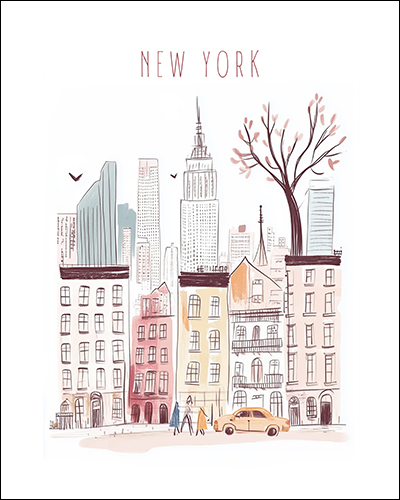
SPRING CITY DRAWING POSTERS
Light city illustrations softened with blossoms and fresh seasonal detail.
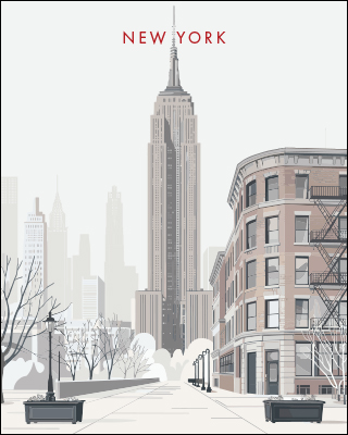
ARCHITECTURAL LANDMARK PRINTS
Clean landmark illustrations with elegant lines and a refined modern look.
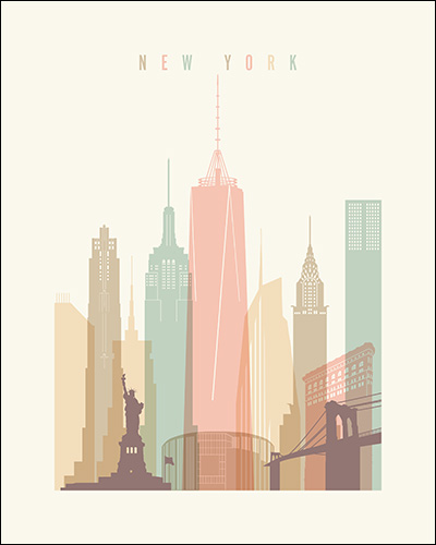
PASTEL TRAVEL POSTERS
Soft pastel travel prints with a calm, airy, destination inspired mood.
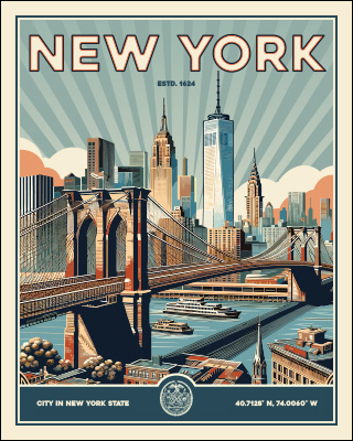
VINTAGE TRAVEL PRINTS
Retro city scenes with rich colour and classic poster charm.
LITTLE DREAMERS
Gentle nursery prints designed to bring warmth, colour, and imagination.
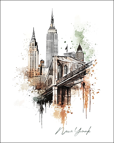
DRAWING IN BOLD STROKES
Expressive sketch style with earthy tones and strong architectural detail.
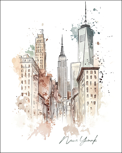
DRAWING IN SOFT HUES
Loose urban drawing style with soft colour and a light artistic feel.
RETRO INSPIRED POSTERS
Vintage inspired colour combinations with a bold graphic presence.
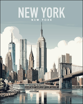
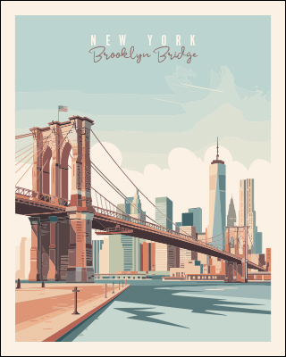
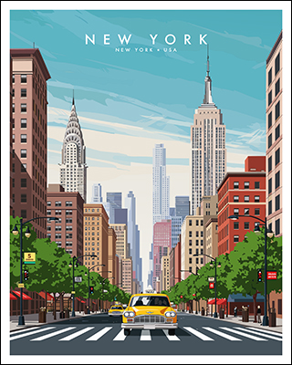
TRAVEL POSTERS
Illustrated destination art with smooth colour and a modern travel poster feel.
CLASSIC TRAVEL PRINTS
Timeless landmark prints with rich colour and traditional poster appeal.
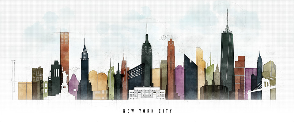
SET OF 3 PRINTS
Coordinated wall art sets designed for larger walls and gallery style displays.
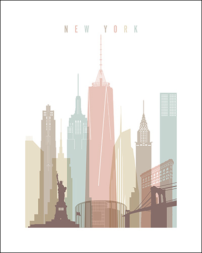
CREAM PASTEL THEME
Soft cream based tones that add warmth, calm, and gentle character.
PASTEL WHITE THEME
Light pastel tones with a clean and elegant finish.
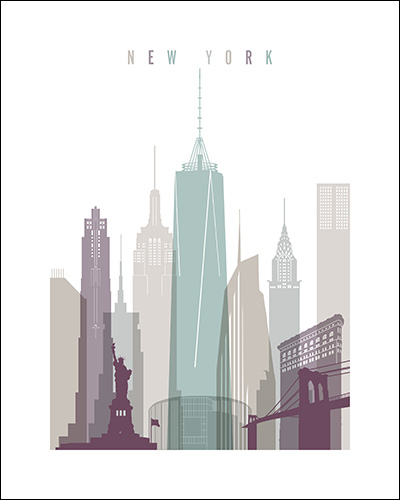
PASTEL 2 THEME
Fresh balanced pastels for bright, easy to style interiors.
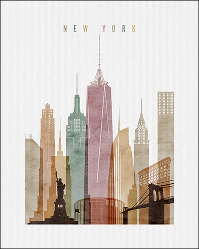
WATERCOLOR 1 THEME
Warm watercolor tones with texture and soft artistic depth.
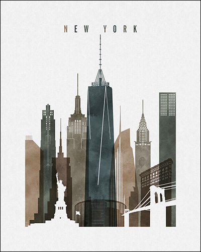
WATERCOLOR 2 THEME
Earthy greens and browns for a calm and grounded look.
WATERCOLOR 3 THEME
Warm vibrant tones with a lively watercolor contrast.
URBAN 1 THEME
Sketch based city style with a youthful and modern feel.
URBAN 2 THEME
Vivid urban artwork with bold colour and fluid detail.
URBAN 3 THEME
Muted pastel urban style with a softer, refined finish.
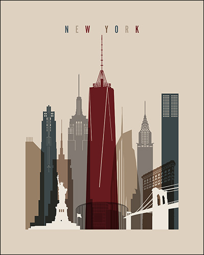
EARTH TONES 1 THEME
Warm earthy shades with a cosy and understated look.
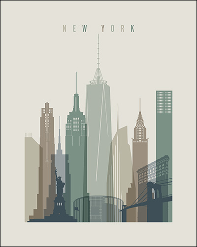
EARTH TONES 2 THEME
Deep earthy colours with a richer and more dramatic mood.
EARTH TONES 4 THEME
Cool muted tones for relaxed and modern spaces.
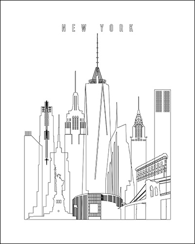
OUTLINE THEME
Minimal line based style with a clean and striking finish.
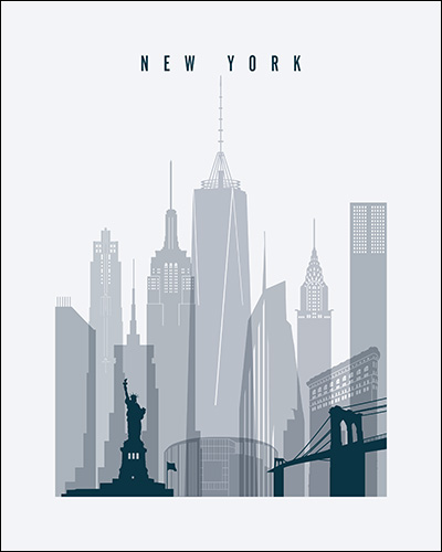
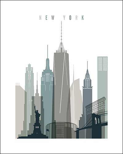
GREY BLUE THEME
A versatile blue grey palette for classic or modern interiors.
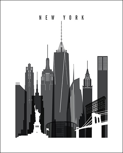
BLACK AND WHITE THEME
Timeless monochrome artwork with strong contrast and clean detail.
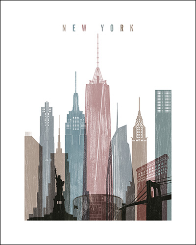
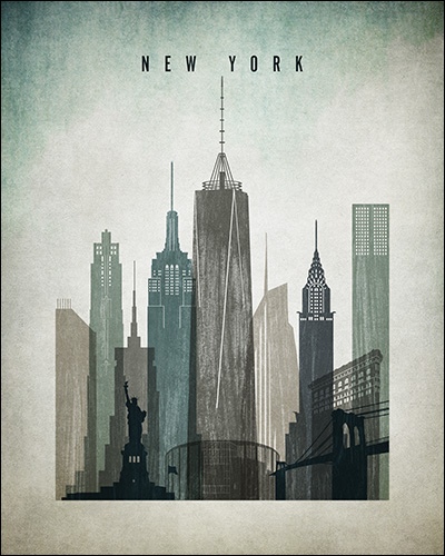
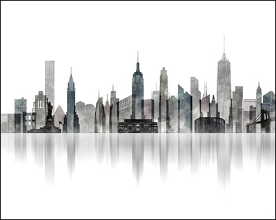
DISTRESSED 1 THEME
Textured vintage style with bold tones and a layered look.
DISTRESSED 2 THEME
A stronger distressed finish with contemporary energy and contrast.
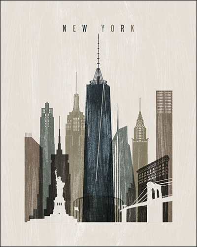
DISTRESSED 3 THEME
Muted distressed tones with a subtle vintage mood.
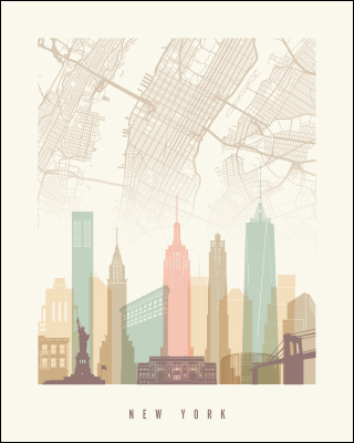
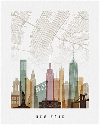
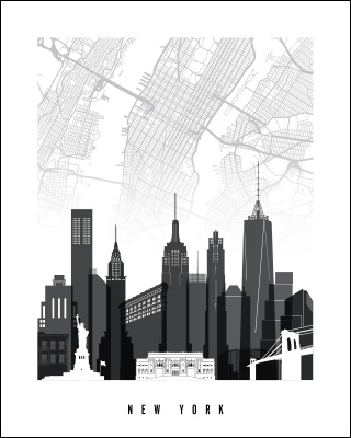
CITY MAP WITH SKYLINE THEME
A layered design combining skyline artwork with city map detail.
PANORAMA CITYSCAPES
Wide skyline compositions with a clean, modern, and spacious feel.
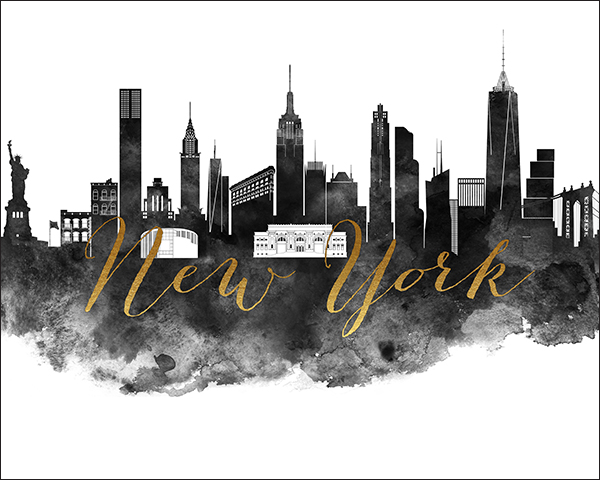
BLACK & WHITE WITH FAUX GOLD TITLE THEME
Monochrome artwork elevated with a faux gold title accent.